

In new research, Grace Fan, Trung Nguyen, and Xi Wu show how improvements in government data transparency and disclosure through the public rollout of the Environmental Protection Agency’s Environmental Justice Screening and Mapping Tool enabled civil society to identify and hold polluters responsible and improve overall environmental justice.
A core tenet of environmental justice (EJ) is that all people and community members, regardless of race, income, or national origin, should have the right to live in a healthy environment. With the rising concern of climate change, EJ has become an increasingly important component of environmentalism. For decades, researchers and policymakers have documented a troubling pattern: low-income communities and communities of color are more likely to live near polluting industrial facilities, breathe dirtier air, and face higher environmental health risks.
One of the primary reasons why environmental agencies and communities have not been able to properly address these concerns is a lack of information. The problem is not that pollution and demographic data are hidden, given that government agencies have long collected and released substantial information, but that the data are hard to assemble into an accessible and actionable picture. When relevant indicators are scattered across technical systems and require expertise to integrate, disparities remain visible only to specialists, and attention and follow-through become uneven.
Recently, agencies have started to tackle this visibility gap by building screening and mapping tools that consolidate existing datasets into intuitive, public-facing visualizations. The goal is not to declare definitive risk or make legal determinations, but to flag places that may warrant closer attention, additional analysis, outreach, or prioritization. When environmental burdens and vulnerability can be seen side-by-side, it becomes easier for regulators and outside stakeholders to focus their limited time and resources where concerns are likely to be greatest.
But does this kind of transparency actually work?
Our research studies one of the most prominent examples of this approach: the UnitedStates Environmental Protection Agency’s Environmental Justice Screening and Mapping Tool, known as EJScreen. By examining how regulators, the public, and firms responded to its rollout, we find that transparency, when paired with effective visual design, can meaningfully improve environmental outcomes in areas with high EJ concerns, or in locations where vulnerable communities disproportionately bear the brunt of pollution.
A quasi-natural experiment in transparency
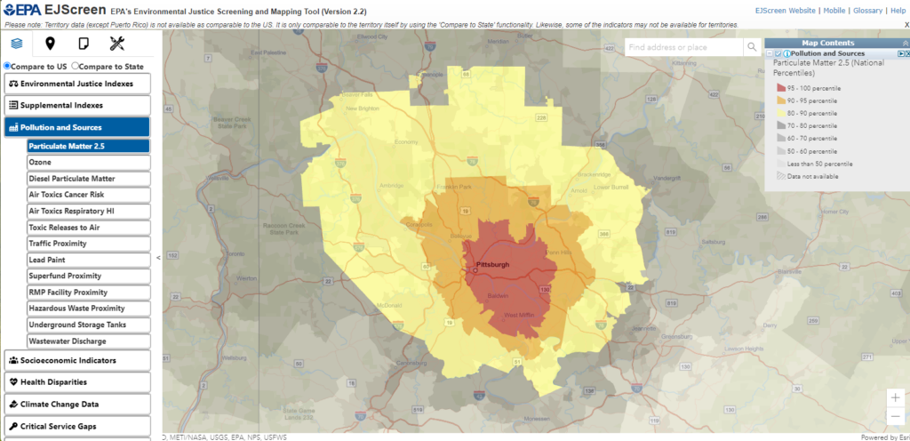
EJScreen was created to address a basic information problem. The EPA already collects extensive data on pollution, demographics, and health risks, but these data were fragmented across sources and difficult to interpret together. EJScreen combined them into a single, interactive map that highlights areas where pollution exposure overlaps with vulnerable populations, such as low-income households and communities of color.
Importantly, EJScreen did not introduce new raw data. Instead, it combined pollution indicators with a demographic index based on the share of low-income residents and people of color to create EJ indexes, then displayed them visually on a map. In our study, we treat an area as having high EJ concern when the area has EJ indexes exceeding the national 80th-percentile threshold — a commonly used screening threshold for highlighting areas for further review. For example, if 4 of 8 displayed indexes are above that threshold, the area’s score is 0.5. A higher value suggests greater EJ concerns. With just a few clicks, users can identify nearby facilities, see which firms operate them, and generate community-level reports.
Figure 1: EJScreen’s 2024 Screening and Mapping Tool Interface
The way EJScreen was introduced created a rare opportunity to study how transparency works in practice. The EPA began using the tool internally in 2012, several years before releasing it to the public in 2015. This staggered rollout allows us to separate the effects of transparency on regulators from its effects on the broader public. Although the EPA opted to disable the tool in February 2025, alternatives, including CalEnviroScreen by the California government and the Public Environmental Data Partners, still exist. Other governments and organizations continue to develop similar tools, demonstrating the impact of monitoring firm behavior with well-designed regulatory efforts even amidst environmental rollbacks.
How regulators responded
The first question we asked is straightforward: did better information change how regulators behaved?
The answer is yes. After the EPA began using EJScreen internally in 2012, facilities located in areas with high EJ concerns became significantly more likely to be inspected. Crucially, this increase did not occur uniformly across all facilities. It was concentrated in communities that EJScreen visually flagged as facing the greatest combined environmental and demographic risks.
This pattern suggests that EJScreen did more than summarize data. By consolidating information and making disparities salient, it helped regulators prioritize their limited enforcement resources. Transparency improved targeting, not just activity.
Interestingly, regulatory inspections increased again after EJScreen was released to the public in 2015. Once communities, journalists, and advocacy groups had access to the same information regulators used, inspection intensity rose further in areas with high EJ concerns. Transparency worked in two directions: it helped regulators identify problems internally and increased external pressure to act.
What changed when the public gained access
The public release of EJScreen in 2015 marked a turning point. EJ information was no longer confined to regulators. It became accessible to anyone with an internet connection.
We observed three clear responses from the public.
First, non-governmental organizations (NGOs) responded. Firms operating facilities in areas with greater EJ concerns as identified by the EJScreen mapping tool experienced a noticeable increase in activist campaigns after EJScreen’s public launch. These campaigns typically targeted parent companies rather than individual facilities, reflecting how EJScreen makes it easy to link local environmental conditions to corporate decisions. For example, a New Jersey-based EJ organization, Ironbound Community Corporation, used EJScreen’s data to take action against Covanta Essex, a company whose large trash incinerator was considered a threat to public health. Similarly, community members in Louisiana petitioned the EPA against air pollution generated primarily by a local neoprene plant using data from EJScreen.
Second, public attention increased. Online searches for the term “environmental justice” rose more sharply in states with greater EJ concerns after the public launch of EJScreen. This pattern suggests that EJScreen did not merely sit unused on a government website. It shaped how the public sought information and discussed environmental inequality.
Third, local media mattered. The effects of EJScreen were strongest in places with more local newspaper coverage. Where journalists were better positioned to translate map-based information into stories, the effects of public engagement and scrutiny were amplified. For instance, local media in California reported that residents could use EJScreen to compare their neighborhood risk with national patterns, highlighting communities with comparatively high environmental risk.
Together, these responses show how transparency can activate a broader accountability ecosystem. Regulators are only one part of the process. EJScreen also empowered NGOs, journalists, and communities to monitor environmental risks and corporate behavior more effectively.
Beyond regulated pollutions: spillovers to climate pollution
The most striking findings of our study concern how EJScreen’s release aligned with measured changes in pollutants.
Some emissions, such as toxic chemical releases tracked under existing EPA programs, are tightly regulated. Others, including many greenhouse gas emissions, are not subject to the same binding enforcement as regulated toxics under EPA.
We find that these two categories responded to transparency in different ways.
After the EPA’s internal adoption of EJScreen, toxic emissions declined significantly in high-EJ areas. This pattern is consistent with enhanced regulatory oversight: when regulators increase inspections in these areas, firms respond by reducing regulated pollutants.
Greenhouse gas emissions tell a different story. Likely because they are unregulated, emissions did not decline following the internal rollout of EJScreen. Instead, reductions appeared only after the tool became publicly available. This timing matters. It suggests that once communities, activists, and the media could clearly see which firms operated in high-EJ areas, firms began reducing emissions that were not directly targeted by regulations, but of broader concern by the public.
These reductions were largest where public engagement was strongest—places with higher search interest in EJ and greater local media presence. In effect, EJScreen altered the information environment in which firms operate, exposing them to reputational and stakeholder pressures that function much like market discipline when formal regulation is incomplete.
Why visual design makes a difference
A key lesson from EJScreen is that transparency is not just about disclosure—it is about design.
Before EJScreen, the data underlying EJ analyses were technically public but practically opaque. Using them required technical expertise, time, and effort. EJScreen lowered these barriers by integrating information into a single interface and emphasizing disparities visually.
Color-coded maps matter. Thresholds matter. When communities are highlighted in red, they command attention in ways spreadsheets and raw datasets do not.
Our findings suggest that visual salience played an important role in shaping behavior. The effects concentrate in areas that are visibly flagged on the map. In related analyses using California’s environmental justice mapping tool, we observe sharp changes in firm behavior when communities cross these visual cutoffs.
In short, how information is presented can be as important as what is disclosed.
Policy lessons at a critical moment
These findings arrive at a pivotal time. EJ initiatives, and EJScreen itself, have faced political pushback and budgetary uncertainty. In March 2025, the EPA announced that it was terminating Biden’s Environmental Justice, Diversity, Equity, and Inclusion Arms of Agency. On the same day, an enforcement memo explained that EJScreen was disabled and could not be used for enforcement or compliance activity, which was consistent with the President’s Executive Orders and with Administrator Zeldin’s “Powering the Great American Comeback” Initiative. Critics often portray transparency tools as symbolic gestures with limited real-world impact.
Our evidence points in the opposite direction. Well-designed disclosure tools can meaningfully improve EJ outcomes by aligning the efforts of regulators and the public. They are relatively inexpensive, scalable, and capable of generating spillovers that formal regulation alone may not achieve.
The implications extend beyond EJ. In areas ranging from climate policy to workplace safety and consumer protection, regulators face constraints on enforcement capacity and legal authority. Transparency, especially when it makes complex information visible and accessible, may help fill those gaps.
Author’s Disclosure: The authors report no conflicts of interest. You can read our disclosure policy here.
The views reflected in this research project do not necessarily reflect the views of the Federal Reserve Bank of Richmond, the Federal Reserve Board, or the Federal Reserve System. Articles represent the opinions of their writers, not necessarily those of the University of Chicago, the Booth School of Business, or its faculty.
Subscribe here for ProMarket’s weekly newsletter, Special Interest, to stay up to date on ProMarket’s coverage of the political economy and other content from the Stigler Center.