

Per capita GDP in the US grew 118 percent over the past 43 years. At the bottom 25th percentile, real income for full-time, full-year, prime-age workers only rose 13.5 percent; at the top 99th percentile, it grew by 166 percent and the top 1 percent grew 322 percent. A new RAND Corporation study on inequality finds that if incomes were as equitably distributed today as they had been in 1975, the share of annual income taken home by the bottom 90 percent of American workers would have been higher by 17 percentage points—$2.5 trillion.
Income inequality is an aspect of economics that resonates with many Americans: It feels like the rich are getting richer, while the rest are having a hard time just getting by. But is it truly getting worse? Calculating this has proven both challenging—and divisive—for economists.
In our new working paper, we enter the fray with an analysis that asks: What would income distribution look like today if incomes grew apace with the economy?
For the period after World War II, we find, incomes and the economy have similar growth rates. Then, starting around 1975, incomes for the bottom 90 percent of individuals grow more slowly than the economy as a whole as incomes for the top 10 percent grow faster. Had the bottom 90 percent kept up with GDP growth, they’d have collectively taken home $2.5 trillion more in income in 2018.
To estimate this, we examine total taxable income (earned income from job, business, or farm, plus the income from interest, rent, and dividends) as measured by the 1976-2019 Current Population Survey (CPS) Annual Social and Economic Supplement (ASEC). We ignore post-tax transfers. We use the personal consumption expenditure (PCE) price index to put income from earlier periods in today’s dollars. And because the CPS doesn’t publish specific incomes above a certain level (for privacy and accuracy reasons, a practice referred to as top-coding) we propose a new method for estimating income above the top one percent.
It is important to enumerate these definitional choices because one part of what makes income inequality research so divisive is just how many such decisions must be made—what is included in income, whose income is measured, how it is adjusted, and more. There are also nontrivial measurement challenges. Most researchers have access only to public data sets, which do not include estimates of taxes or enumerate income above a certain amount.
Overlying all those technical issues is a conceptual one: What should the distribution of income in the US look like? Some ideal is assumed (implicitly or explicitly) by the points of comparison chosen.
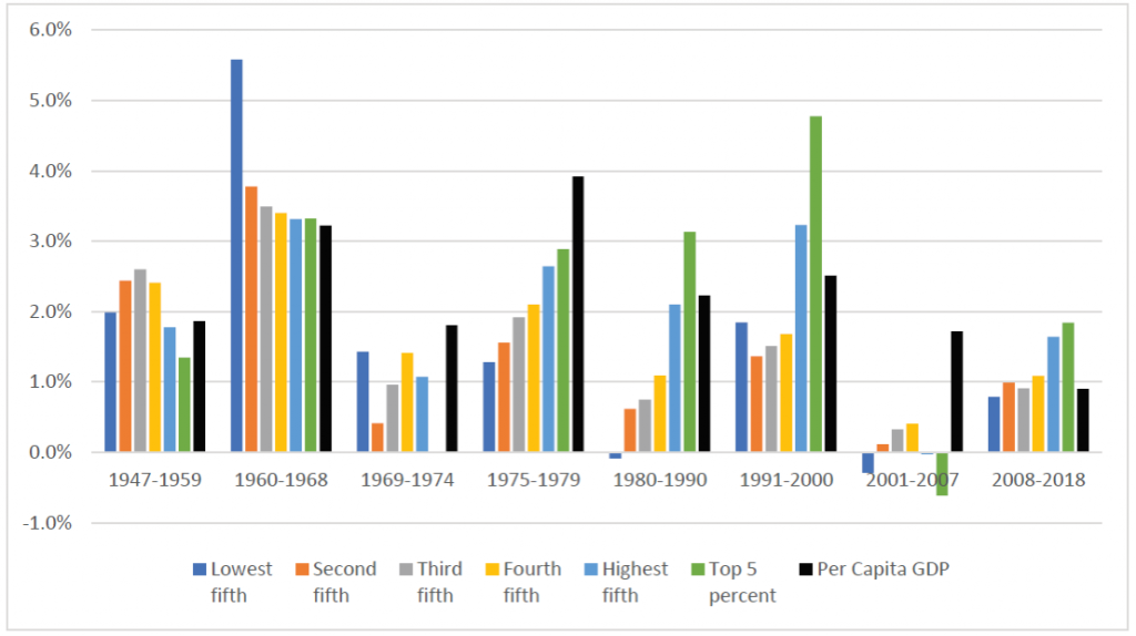
The conceptual framework in our paper is income growth. This measures not only the income gap between the top and bottom earners, but also the difference between how fast incomes at the top and bottom are growing. As our comparison point, we use economic growth, measured through per capita GDP. In other words, as the economy grew from 1947 to 2018, did that tide continually lift all—or even most—boats?
As shown in Figure 1, the thirty years after World War II resemble a “picket fence” of relatively similar growth rates across business cycles for rich and poor alike. After 1975, that is replaced by “hills” in which income growth increases with income. In the 2001-2007 business cycle, income hardly increases for any group, if it does at all.
We develop a measure, which we call omega, that is the difference between two growth rates: the observed rate and a target rate. Although we chose per capita GDP for our target rate, it could be anything—the growth rate of consumer prices, for instance, or health care prices, or the income growth of a specific group (say, the top one percent). Constructing omega allows for a quick way to compare various groups’ income growth rates relative to a target. It also allows construction of counterfactual income, what income would have been had the observed rate matched the target rate.
In some ways, per capita GDP is not an ideal target rate. To start, it includes capital depreciation but excludes non-wage compensation (like health insurance), both of which become a larger issue starting around 1975. Arguably, the former would overestimate growth in the economy and the latter would underestimate growth in income. These are fair objections. Yet, per capita GDP is economically meaningful as a benchmark. It was also broadly achieved for three decades following World War II by the bottom 90 percent, and is still being achieved by the top five percent today.
In Table 1, we show the observed income growth at different points of the distribution at business cycle peaks (the year before a recession), the counterfactual income level had income growth matched GDP growth, and the omega, the difference in growth rates. If omega is less than 100 percent, income grew slower than GDP, if omega is more than 100 percent, income grew faster than GDP.
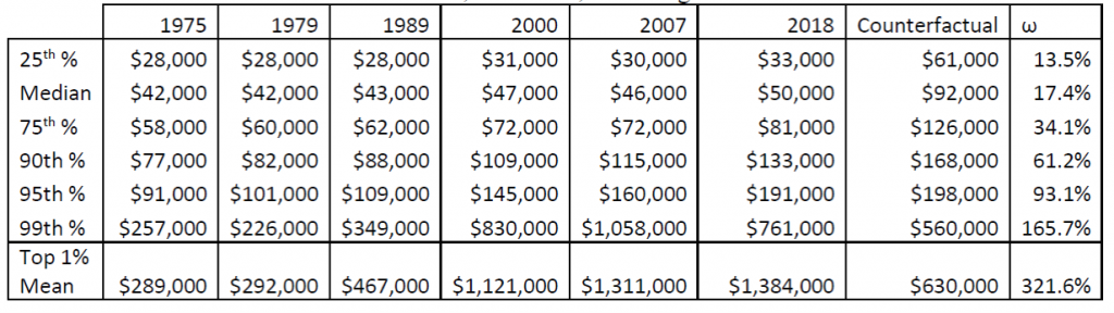
For workers at the 25th percentile of income, their income in 1975 was $28,000 per year in real 2018 dollars. If those incomes had kept pace with GPD growth (the counterfactual), their 2018 income would be $61,000. In actuality, it rose to only $33,000.
By contrast, for workers at the 99th percentile of the income distribution, their 1975 real income of $257,000 would have risen to $560,000 by 2018 at the target growth rate. In fact, it rose to $761,000.
In other words, over these 43 years, per capita GDP grew 118 percent, but at the bottom, income only rose 13.5 percent; at the top, it grew by 166 percent.
“Over these 43 years, per capita GDP grew 118 percent, but at the bottom, income only rose 13.5 percent; at the top, it grew by 166 percent.”
One methodological innovation in our paper is a new way of estimating the income of the top earners. In the CPS, each person has a value for their reported income, but at a high enough income level, all the incomes are the same—some maximum amount called the top-code—for privacy reasons. To get around this and assign each person an income, researchers have to define a distribution of what income looks like above the top-code and then append the estimated amounts (based on the distribution) to the CPS data. This practice is referred to as tail imputation: “tail” for being the very top, and imputation for estimating an income amount.
Tail imputation is not a trivial task; and often, researchers do not have a lot to go on about what the top incomes look like. We use the World Inequality Database (WID), which is based on tax records and provides more information than is typically available, to fit a distribution. Given just how much income is taken home by the top one percent, tail imputation is a critical part of any inequality assessment and we hope our method generates its own interest and assessment.
The bottom row of Table 1 shows why estimating the income of the top one percent is so important. These 2.5 million individuals would have seen their income rise from an average of $289,000 to $630,000 between 1975 and 2018 at the target growth rate. But their realized income in 2018 was $1,384,000, more than 300 percent of the target growth rate.
These divergent growth rates accumulate over time. In figure 2, we show what share of total pre-tax income goes to the bottom 90 percent, the 90-99 percent, and the top one percent.
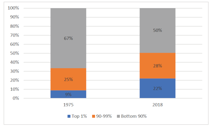
The difference between 1975 and 2018, in terms of the share of income taken home by the bottom 90 percent, is 17 percentage points—or $2.5 trillion in a single year. Over the whole 43 years, it’s $47 trillion. That’s so large, it becomes difficult to interpret. But that’s what happens when incomes at the bottom grow at a rate that’s about 20 percent of GDP, and top incomes grow at 300 percent of GDP over four decades.