

Guidelines assume that the less people move around, the less likely they are to be in contact. However, phone location data show that in March and April people moved less, but still gathered in smaller—and more dangerous—places, such as churches.
How has social distancing reshaped movement patterns in America? It’s clear now from a variety of data sources that social distancing measures have drastically reduced average movement levels in the US. People are leaving their homes less often, and when they do, they don’t go as far. US residents moved almost 80 percent less than average during March as compared to February, based on measures of average distance traveled.
And yet, in terms of stopping the spread of infection, these “mitigation” measures have not been nearly as effective as some experts had hoped; and some communities, particularly minority communities, have been especially ravaged.
Does social distancing simply not work as well here as it does elsewhere? Or are the data misrepresenting how much social distancing we’ve really done?
Now that the re-opening of states is in the early phases, these uncertainties regarding best-practices only make the already difficult decisions facing local officials harder.
In this context, it becomes essential to have reliable metrics showing the true effect of the different policies put in place to ensure social distancing.
In our recent working paper Density and Distancing in the COVID-19 Pandemic, we present evidence that social distancing hasn’t changed movement patterns by as much as other data might suggest.
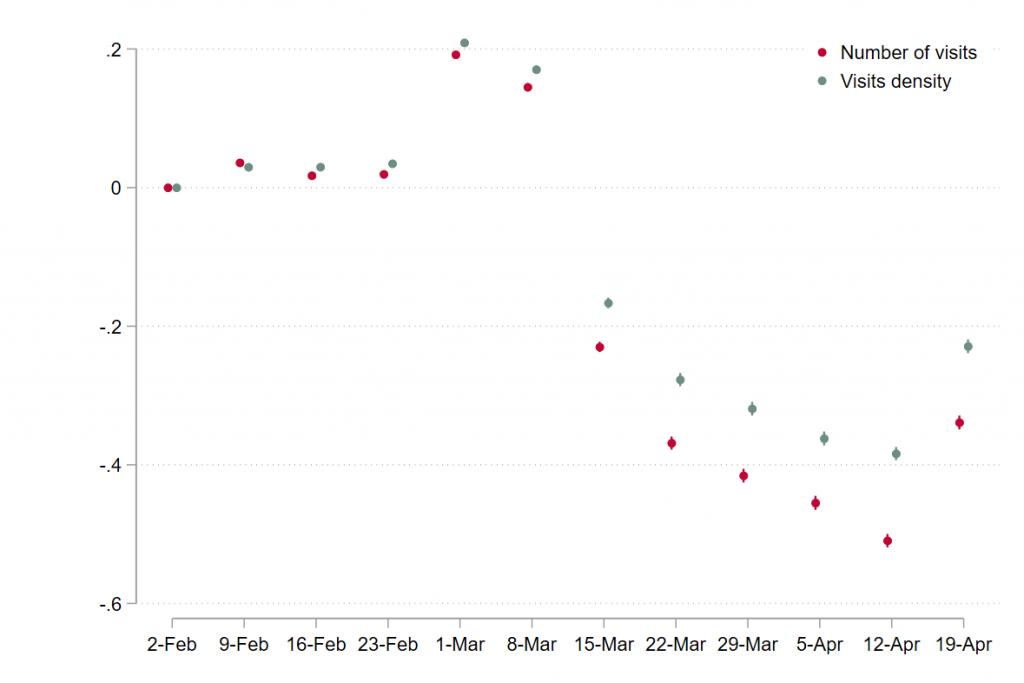
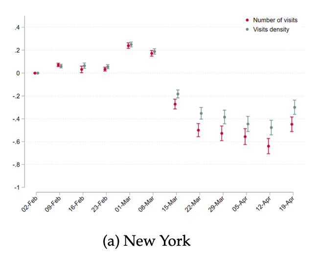
“Based on a large sample of cell phone location data from Safegraph, we find that overall foot traffic in March and April was down roughly 40 percent from February; but foot traffic density was only down by 30 percent over the same period.”
After accounting for the average size of places that individuals frequent, we find that foot traffic density—as in, the number of people per square foot of space recorded in a given day or week—has gone down roughly 25 percent less than overall foot traffic levels.
Based on a large sample of cell phone location data from SafeGraph, we find that overall foot traffic in March and April was down roughly 40 percent from February, but foot traffic density was only down by 30 percent over the same period.
This wedge between relative foot traffic and relative foot traffic density begins right after the first drop-off due to social distancing and then remains remarkably steady over the weeks that follow.
Moreover, since we restrict the sample to locations that remained open throughout this period, this implies that smaller locations must be taking up a larger share of foot traffic in late March and April than they did in February: while people are moving around less than before, they’re also going to smaller places on average.
Given that contagion risk is higher when folks are closer together, this means that Americans weren’t actually social distancing, as well as the unadjusted data would have you believe.
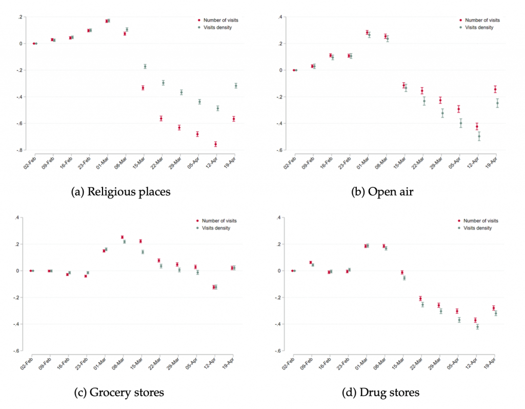
But not every type of place has seen the same pattern. In grocery stores, drug stores, and open-air places (such as parks), people have actually shifted in the opposite direction: for these places, density has gone down by slightly more than average foot traffic, as individuals seem to favor larger stores and parks in the wake of the pandemic.
In contrast, visits to religious places, such as churches, have gone down considerably more than visit density. This means that either individuals have aggressively substituted towards smaller churches from larger churches, or that congregations in larger churches have decreased attendance far more severely than congregations in smaller churches, or some combination of both.
We can also see this by breaking down the changes in foot traffic by location size, rather than looking at density.
Here, we see the differential effect clearest of all: above-median size religious places have seen an almost 100 percent reduction in foot traffic by April, compared to a roughly 50 percent reduction in below-median size religious places. Smaller churches haven’t implemented social distancing to nearly the same degree that larger churches have.
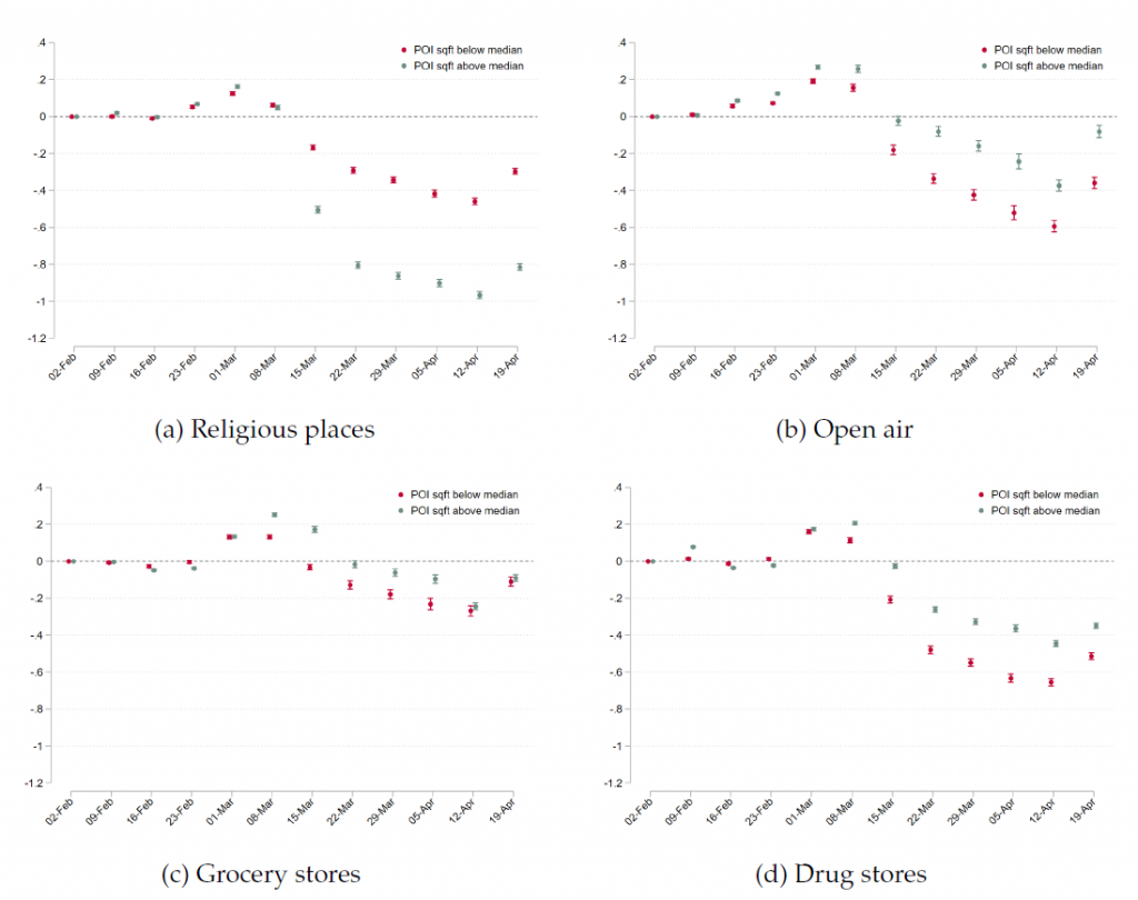
Given the number of super-spreader events that have been traced to religious gatherings in the US, this suggests that a key missing piece of the puzzle may be found in this differential response by church size.
If smaller churches have social distanced less than larger—and if smaller places are already higher contagion risks—than this might help explain why mitigation measures have been less effective at containing the spread than people expected, given the data that they were looking at.
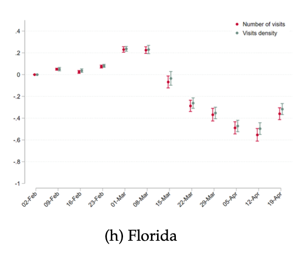
This gap between density changes and overall movement may also help explain some of the geographic heterogeneity in infection rates across the US. Breaking our analysis down to a state-by-state level, we find that this ‘wedge’ between density changes and foot traffic changes is smallest in Sun Belt states, such as Florida, as well as a number of Western states. But it appears to be larger in the mid-Atlantic region and New England, including New York, New Jersey, and Massachusetts.
Taken together, our analysis shows that our current understanding of social distancing is still missing at least a few key pieces.
The guidelines were put in place in order to enforce a distance of six feet between individuals, but most of our evaluations of these guidelines have used coarse measurements of overall movement patterns, on the assumption that the less people move around, the less likely they are to be in contact.
“Visits to religious places, such as churches, have gone down considerably more than visit density . But smaller churches haven’t implemented social distancing to nearly the same degree that larger churches have.”
But if this six-foot threshold is truly what matters for contagion, then the gap between these coarse measures and the policy mechanism is also a gap in our understanding, and in our ability to effectively organize and respond to this challenge.
Data-driven policy can only be as good as the data that drives it; and often, the best way to solve a puzzle is to make sure that all the pieces are on the board.